These guidelines are intended to help you follow the standard formats for the IUP website.
Following the standard formats will increase consistency and usability across the website and maximize Google searchability.
Introduction and Heading Styles
Use them according to the guidelines below. They are not interchangeable.
Introduction
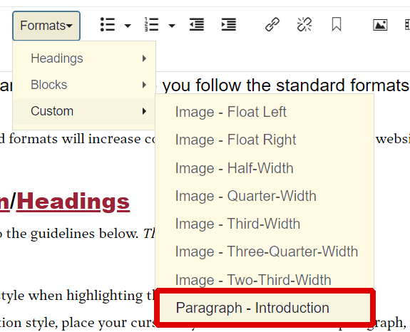
Use the introduction style when highlighting the first paragraph of your content.

To apply the Introduction style, place your cursor anywhere within the first paragraph, then choose the style from the editing toolbar (see image at right).
The point of the introductory style is twofold:
- It shows people where to start reading. This is particularly important on a busy webpage that includes many navigational elements.
- It encourages writers to have a strong lead sentence for the web page. That first sentence should always tell you the one most important thing a visitor to that page needs to know. Many visitors won't get any further. So if the first sentence isn't a good introduction to the page—it should be.
Note: The introduction style is for the first paragraph only. Do not use the introduction style in place of headings.
Headings
Use headings for the section headings within your content. They should be used in descending order, starting with Heading 2 for the primary side heads. Sub-heads within the primary Heading 2 use Heading 3, etc.
These are accessibility issues, so use headings for their function, not for their appearance.
- Do not use headings for whole sentences or paragraphs.
- Do not use headings out of order.
Examples:
Grants (Heading 2)
Following is information about grants offered through the office.
Grant A (Heading 3)
This grant provides funding to eligible undergraduates ...
Grant B (Heading 3)
This grant provides funding to eligible undergraduates ...
Scholarships (Heading 2)
Following is information about scholarships offered through the office.
In-State Scholarships (Heading 3)
This scholarship provides funding to eligible undergraduates ...
Scholarship A (Heading 4)
This scholarship provides funding to eligible undergraduates ...
Scholarship B (Heading 4)
This scholarship provides funding to eligible undergraduates ...
Out-of-State Scholarships (Heading 3)
This scholarship provides funding to eligible undergraduates ...
Please note the following:
- Use of headings helps with Google searchability.
- Headings need to be used correctly to be accessible (ADA requirements)
Mixing the Two
Do not use introduction and a heading style. This alters the heading appearance and consistency.
Showing Emphasis
Italics
Use italics to show emphasis. However, overusing italic type detracts from its ability to show emphasis.
Bold
Reserve bold for when you really need it. Overusing bold detracts from its ability to show emphasis. Using bold in text also detracts from the ability of headings to stand out on a page.
All Capitals
Do not use all capitals. They make text more difficult to read, and some people interpret them as yelling.
Note: Organizing text with the appropriate headings, ordered lists, and other styles may be a more effective way of showing emphasis.
Links
Define the Link
The linked text should tell a person what is on the other side.
Do
Learn more about the American Psychological Association.
Don't
- Click here to learn more about the American Psychological Association.
- Learn more about the American Psychological Association ... More.
URLs in Text
Do not use URLs in text.
Do
See American Psychological Association for more information.
Don't
See American Psychological Association, http://www.apa.org/, for more information.
Do not link a person's name to an email address. Link a person's name to a page with more information about the person, but write out an email address.
Questions may be directed to Mike Powers, mpowers@iup.edu.
Inserting Links
Links should always be text-based, not a bare URL.
For internal links (to items within the Cascade CMS), click on the Link Source field to choose a file, page, or link.
For external links (outside of the www.iup.edu website), add the link to the Link Source field.
Ordered and Unordered Lists
Use the ordered or unordered list options in the formatting toolbar. Do not use special “bullet” characters or type the number of the listed item. Instead, highlight the lines that you want included in the list and select the desired option. Aside from maintaining a consistent style, doing this is also an accessibility requirement, as it allows people with visual impairment to understand that what they are reading is an actual list.
Other Points
- Do not make surrounding punctuation—such as periods, commas, or quotes—part of the link.
- Avoid making links bold.
Customized Formatting
Please use the standard formatting styles provided on the toolbars within the CMS editor. Centered and underlined text, for example, are not used on the website.
Also, use the ordered-list styles—bullet points and numbered lists—provided by the CMS, rather than creating them by hand.
Tables
Avoid use of tables when possible. There is a growing focus on making websites more accessible to people with disabilities, and tables are not easily translated for those who use screen readers on the Web.
If a table is needed, [need info and link]
Images
[links are inactive yet]
Photos and other graphics should be sized appropriately before being uploaded into the CMS. Do not resize images within the CMS; uploading oversized images is an inefficient use of storage space on the central server.
Standard photo sizes for the IUP website are as follows:
| Use | Width | Settings |
|---|---|---|
| Full width | 750 pixels | Responsive |
| Half width and below | 737 pixels | Left- or right-aligned Responsive Half-width |
| Photo Gallery Image, Horizontal | 750 pixels | Follow aspect ratio |
Divisions in Text
Do not use lines or combinations of symbols to make divisions in text. Proper use of headings should suffice.
Examples of what not to do:
______________
~~~~~~~~~~~
-------------------------